
Customize the Virtual Agent Chat Button in Service Portal
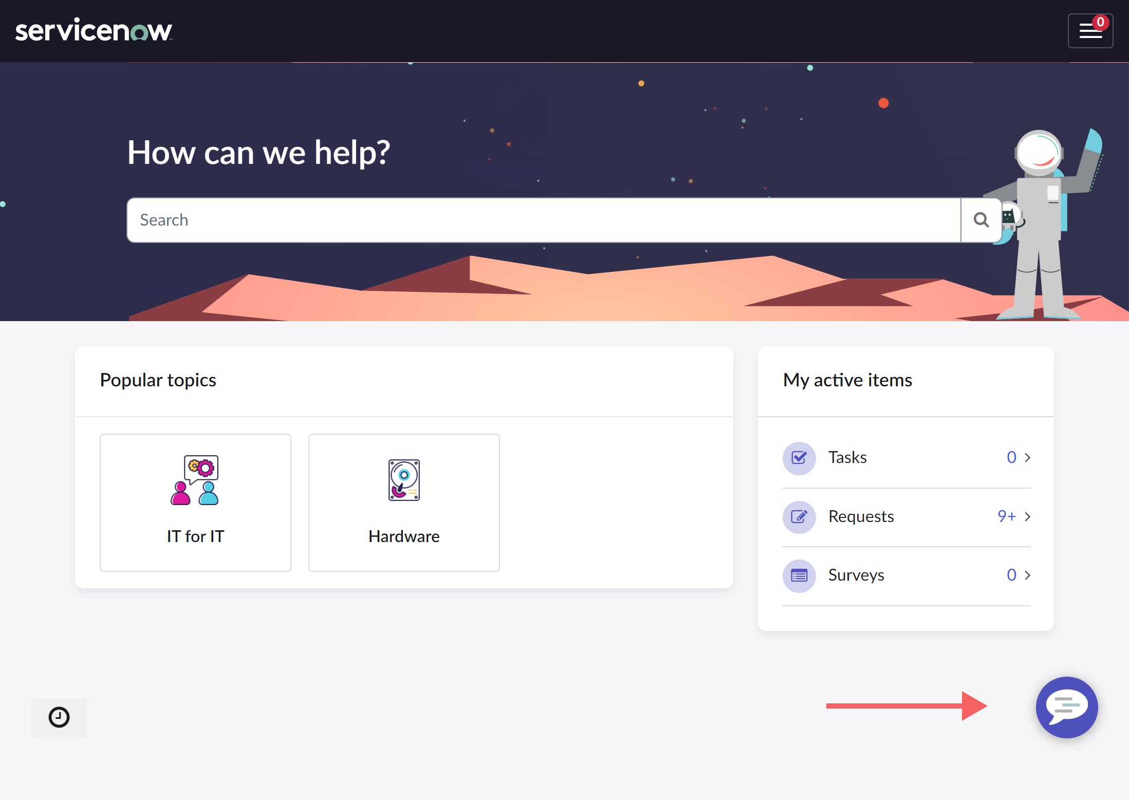 One of the easiest ways to align the Virtual Agent experience with your organization brand is to update the VA chat button that displays in the Service Portal. Recently, I had to walk one of my developers through the process of aligning the chat button with a given design and was reminded that there are a few different options to consider. Here are the consolidated steps I take for this common ask.
Change the Background color
First, let’s change the background color from “Polaris Purple” to something that aligns with my chosen brand colors.
- Navigate to the theme assigned to your chosen Service Portal. For the Employee Center, this is the EC Theme.
- In the CSS Variables field, scroll to the very bottom, or search for the SCSS variable $sp-agent-chat-bg.
- Assign the SCSS variable to your chosen background color.
Notice that this SCSS variable is set to $brand-primary. If you want to align the color of this button with other interactive elements, you can leave this as it is and instead change the $brand-primary SCSS variable.
/* Set the brand colors as their own SCSS variable to be used throughout your theme */

$brand-purple: #60217D;
$brand-gold: #ffd840; // If these colors are ever changed, you only have to update the hex code in one place

/* Set the $brand-primary OOB theme variable to your custom brand color variable */

$brand-primary: $brand-purple;

/* SCSS variable controlling the VA button background color stays as-is */

$sp-agent-chat-bg: $brand-primary;
However, this will change MANY different elements in your portal to the assigned color. For some portals, this is ok. For others, a secondary color can be used from the brand color palette that helps the VA button “pop” off the page to be more easily noticed by the user (such as $brand-warning or $brand-info). For this example, I’ve chosen a sunny shade of yellow as a part of an example brand.
/* Set the brand colors as their own SCSS variable to be used throughout your theme */

$brand-purple: #60217D;
$brand-gold: #ffd840; // If these colors are ever changed, you only have to update the hex code in one place

/* Then use the brand color SCSS variable to set applicable OOB theme variables */

$brand-primary: $brand-purple;
$brand-warning: $brand-gold;

/* Change the VA button background SCSS variable to your chosen variable */

$sp-agent-chat-bg: $brand-warning;
You can also create a custom SCSS variable to assign to $sp-agent-chat-bg, or use a plain color hex code. I recommend using SCSS variables whenever possible, to make it easier in the future to make changes or assign additional elements to the same color.
/* Set the brand colors as their own SCSS variable to be used throughout your theme*/

$brand-purple: #60217D;
$brand-gold: #ffd840; // If these colors are ever changed, you only have to update the hex code in one place

/* Change the VA button background SCSS variable to your custom SCSS variable */

$sp-agent-chat-bg: $brand-gold

/** OR **/

/* Change the VA button background SCSS variable to your chosen hex code */

$sp-agent-chat-bg: #ffd840; // Not recommended, but sometimes it is what it is.
Change the icon(s)
Another change you can make to get away from the out-of-box look is to change the chat icon in the VA chat button. You can do this both for the image that displays when the chat window is closed as well as when it’s open and active.
Change the initial (close) chat button icon
 To start, we’ll change the image that displays when the portal is initially loaded. This view is the “close” button, because it displays when the chat window is closed.
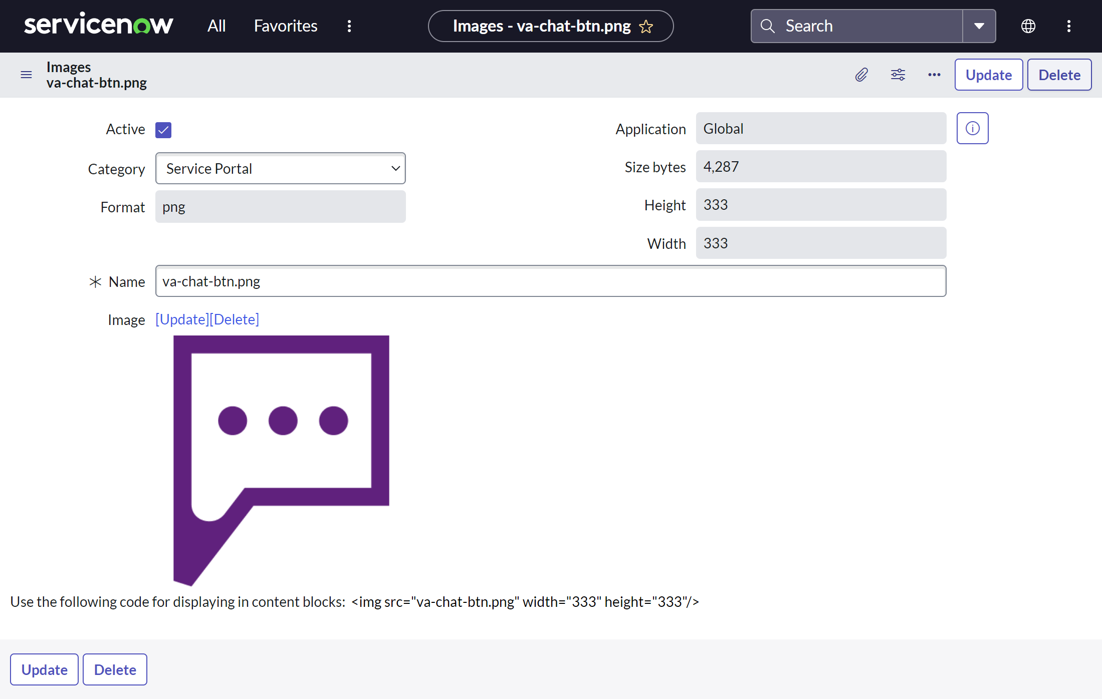
- Navigate to the images table by going to System UI > Images
- Create a new record for your VA chat button image.
- Name your image: do not use spaces, and end the name with the type of file extension you’ll be uploading (example: my-image.png).
- Upload an image with a transparent background. If the image has a background, it will overlap the background color you chose above.
- Copy the name of your image, you’ll need it soon
Now that your image is uploaded to the instance and ready to use, navigate back to your portal’s theme record.
From here, we’ll take one of a two approaches.
Your implementation is still “out-of-box”:
I make this differentiation because I have run into some implemented instances where this first method doesn’t work due to customizations in the environment. In most cases though, your configuration efforts will be pretty straightfoward (thanks Mark Roethof).
In the theme record CSS Variables field, add the following SCSS variable if it is not already included in your theme:
$sp-agent-chat-btn-close: url('/your-img.png'); // VA Chat icon displayed when chat window is closed (click to open)
“Out-of-box” isn’t working
Sometimes, we inherit (or created) a situation where different customizations mean that the above variables are broken and the chat button doesn’t respond to setting them. If this is the case, below is a workaround for the button image shown when the chat window is closed.
From the theme record, create a new CSS include with a new stylesheet, named “Virtual Agent Branding”
Why this approach? I find it easier to divide your theme CSS into its various pieces and parts (such as pages or widgets), rather than throw all of your custom styles into one stylesheet. Easier to find what you’re looking for, easier to maintain. Custom CSS should almost always be placed in CSS includes; reserve your theme’s CSS Variables field for SCSS variables and mixins.
In your new stylesheet, add the following CSS:
/* VA Button icon */

/* Button icon displayed when chat window is closed */

.sp-ac-root button.sp-ac-btn.closed .sp-ac-btn-icon{
     background-image: url('va-chat-btn.png') !important; // In the URL tag, place the name of the image you uploaded
}
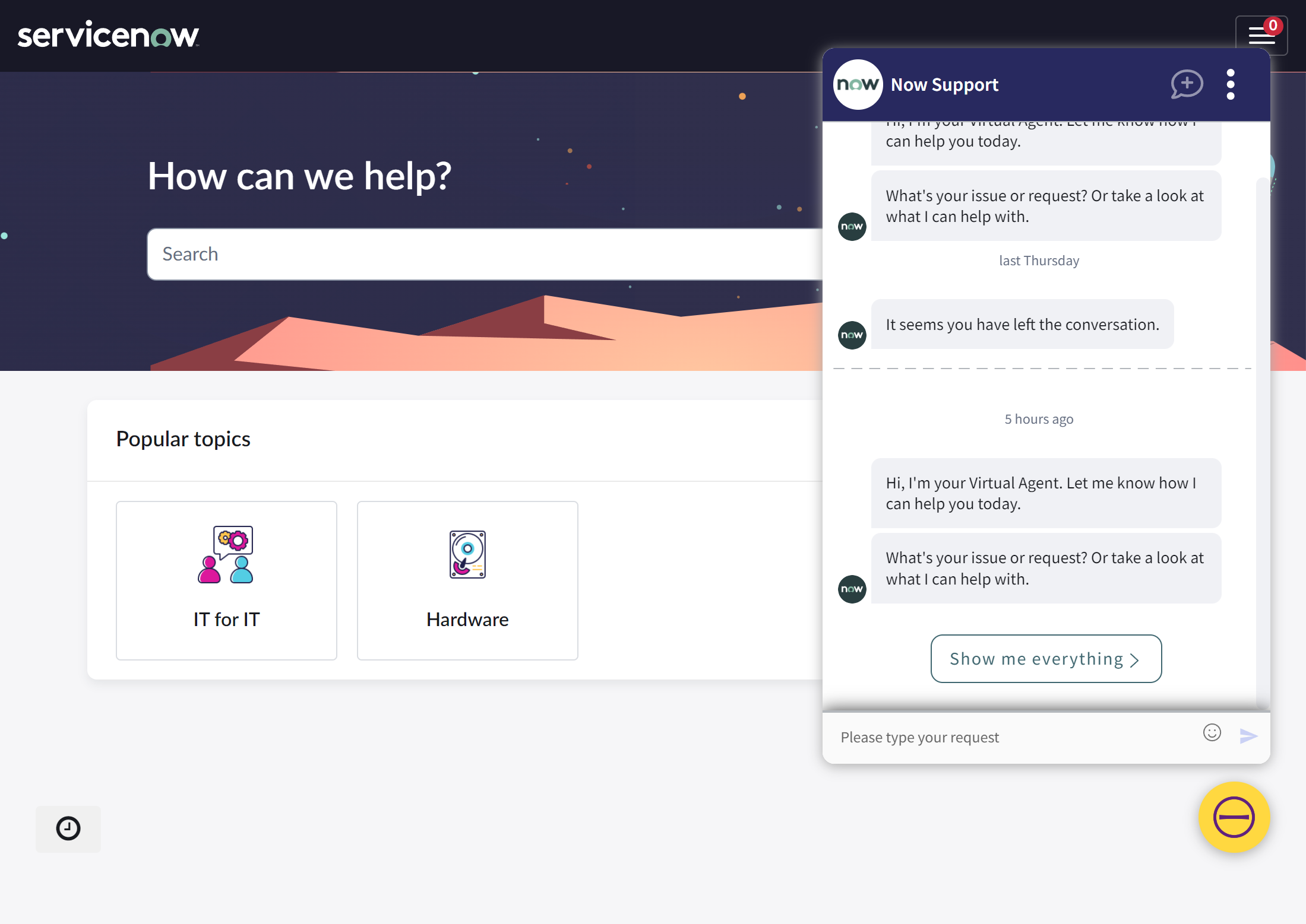
Refresh and check the changed image on the VA chat button in your portal. Depending on how the customizations in your instance have been done, this should provide an override that changes the CSS rendering the image if the SCSS variables aren’t responding.
Adjust sizing (optional)
 This icon renders a bit too large for my VA chat button. We want to give our visual elements “breathing room” so as to keep the UI from looking cluttered. If you need to adjust sizing, you can do so via CSS. Note this is the same CSS selector used above for the non-oob workaround. We’re just adding a few more properties:
- Width and Height: Adjust both equally to center the image.
- Margin: Adjust margin up if you’re making the image smaller, or down if you’re making the image larger to center the icon you’ve resized.
/* Button icon displayed when chat window is closed */

.sp-ac-root button.sp-ac-btn.closed .sp-ac-btn-icon{
     width: 3rem;
     height: 3rem;
     margin: 1.7rem;
}
Change the open chat button icon
The “open” icon displays when the chat window is open. For the open icon, you can take one of two paths, not necessarily dependent on the level of customization in your instance.
Custom image called via SCSS variable:
If your implementation is out-of-box and responding to the SCSS variables as they should, you can upload a custom image of your choosing as described above and set it in a similar SCSS variable:
$sp-agent-chat-btn-open: url('/your-img-open.png'); // VA Chat icon displayed when the chat window is open (click to close)
If you want to adjust the sizing of your image, you can do so in a fashion similar to that used for the close button:
/* Button icon displayed when chat window is open */

.sp-ac-root button.sp-ac-btn.open .sp-ac-btn-icon{
  height: 5rem;
  width: 5rem;
  margin: 0.5rem;
}
Change retina icon via custom CSS:
If the change you want to make to the close icon is simple, or if your instance has customizations that don’t allow you to use the SCSS variables, you have another option.
From my poking around, it doesn’t seem like you can change the close icon via CSS as easily as you can the open icon. This is because the close icon isn’t technically an image. It’s an icon embedded via CSS on the ::before CSS pseudo element (this is a common tactic for icons in Employee Center widgets). If the SCSS variable mentioned above isn’t working for you, you’ll be limited to altering the “close” icon to another in the retina icon set.
If you want to change the close icon to one of the other icons in the set (in this example, the minus sign), you can do so by placing this CSS in your include:
/* Button icon displayed when the chat window is open */

.sp-ac-root button.sp-ac-btn.open .icon-cross::before{
     content: "\f1fc"; // unicode for the specific icon chosen
}
You can view the entire icon set you can choose from at https://<your_instance_here>.service-now.com/styles/retina_icons/retina_icons.html (thanks Shiva Thomas).
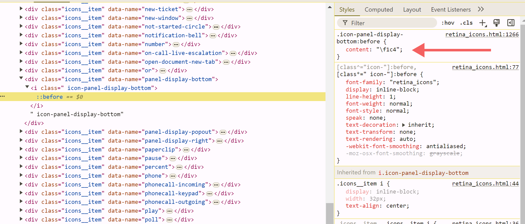 From this list, you can find the icon’s unicode to embed in the CSS above:
- Right click on the icon you want to use open the element inspector.
- Open your icon’s <div> element, then the <i> element that appears.
- Click on the ::before pseudo-element. The styles on the right will show a value called “content”. That value is the unicode value for your icon.
- Insert the unicode into the CSS above set in your CSS include.
This will display your chosen icon in white, the out-of-box color.
If you want to change the color of the icon that appears, you can easily do so by adding a color property to the CSS above:
/* Button icon displayed when the chat window is open */

.sp-ac-root button.sp-ac-btn.open .icon-cross::before{
     content: "\f1fc"; // unicode for the specific icon chosen
     color: $brand-purple; // or a hex code, but see above, I will judge you
 }
You can also change the size of the retina icon that appears. It’s a different process though; because this is technically text, we’ll be adjusting the font-size property as well as the margin.
/* Button icon displayed when the chat window is open */

.sp-ac-root button.sp-ac-btn.open .icon-cross::before{
     content: "\f1fc"; // unicode for the specific icon chosen
     color: $brand-purple; // or a hex code, but see above, I will judge you
     font-size: 3rem;
     margin: 1.2rem;
}
In Conclusion
The Virtual Agent is an invaluable tool for connecting with your users and encouraging them to engage in self-service from your Service Portal. As you align your Service Portal / Employee Center to organization brand, don’t ignore this vital tool in your portal’s feature set. Configuring the main chat button is the first step to ensuring that your VA is an integrated, seamless part of your branded experience.
Date Posted:
August 6, 2024
Share This:


Fresh Content
Direct to Your Inbox
Just add your email and hit subscribe to stay informed.
