
Leveraging ServiceNow with Highcharts: Transforming Data into Insight
In today’s data-driven world, organizations are constantly seeking innovative solutions to transform complex datasets into actionable insights. ServiceNow, a leading cloud-based platform for digital workflows, provides extensive data handling and management capabilities. However, to truly leverage the power of data visualized effectively, integrating a robust tool like Highcharts can elevate the presentation and interpretation of data. This article explores how combining ServiceNow with Highcharts can transform raw data into clear, insightful visual representations, aiding businesses in making better-informed decisions. We’ll delve into the benefits of this integration, practical use cases, and tips for seamless implementation, setting the stage for a more intuitive and strategic approach to enterprise data analysis.
Highcharts is a flexible, feature-rich JavaScript library that allows developers to create interactive charts for the web. By integrating Highcharts with ServiceNow, you can transform static data into engaging visualizations, providing your users with a more intuitive, interactive experience. In this article, I’ll walk you through the process of integrating Highcharts with ServiceNow, showcasing use cases, and tips to get the most out of this powerful combination.
Why Integrate Highcharts with ServiceNow?
ServiceNow provides basic reporting and visualization features, but for more advanced charting needs—such as interactive dashboards or detailed drill-down capabilities—Highcharts offers several advantages:
- Customization: Highcharts offers a wide range of chart types (line, bar, pie, scatter, etc.), and the ability to customize almost every aspect of the chart.
- Interactivity: With Highcharts, users can interact with charts by zooming, clicking data points, and receiving real-time feedback, making data exploration more engaging.
- Real-time Data: You can easily configure charts to update in real-time, providing up-to-the-minute insights.
- Extensibility: Highcharts offers numerous plugins and extensions, allowing you to extend functionality as needed.
By combining ServiceNow’s robust data management with Highcharts’ visualization capabilities, organizations can create more effective reports and dashboards that drive better decision-making.
Licensing:
For this article, which has educational purposes, I will download version 11.4.3 of the library and use it in my PDI. For commercial use, it is recommended that you purchase licenses directly through their website. Another option is to use the version available within the platform, which in my research (<instance-name>/scripts/glide-highcharts.js) is 9.3.2.
Using the paid version:
In my article “Importing Excel to Servinow” I showed how to import a library into SN. Just follow the same steps to import the Highcharts library.
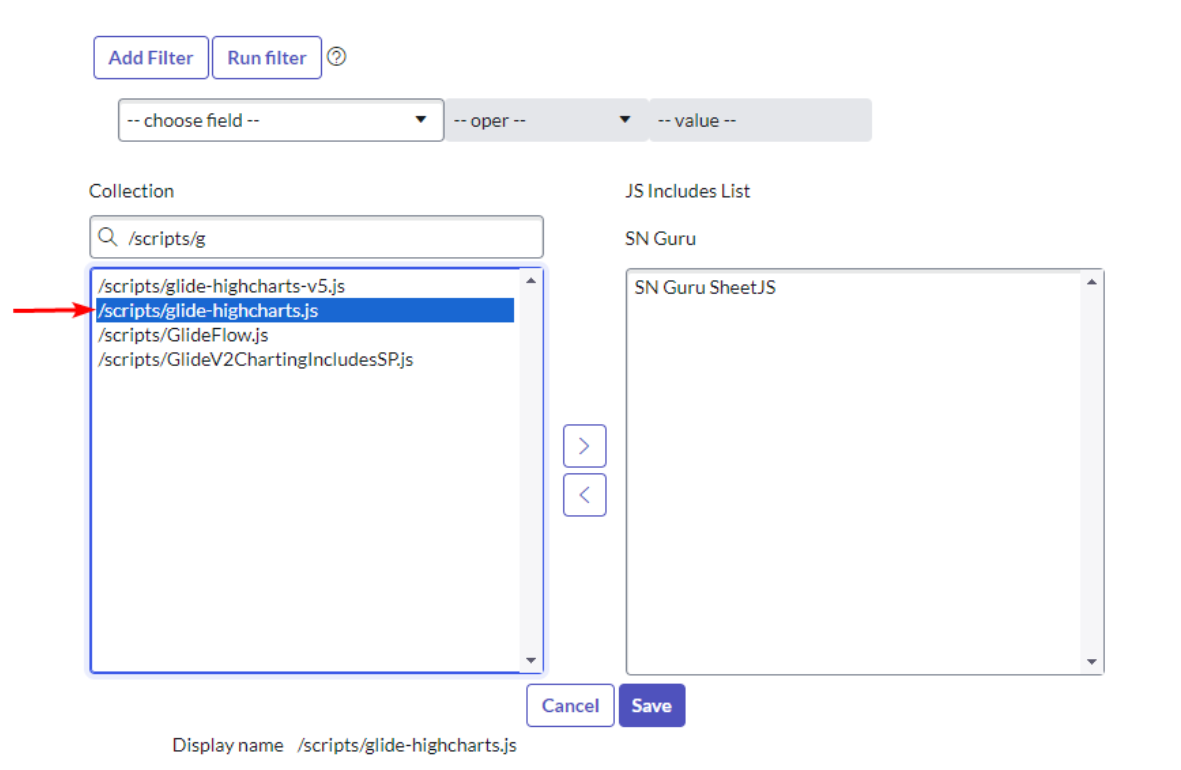
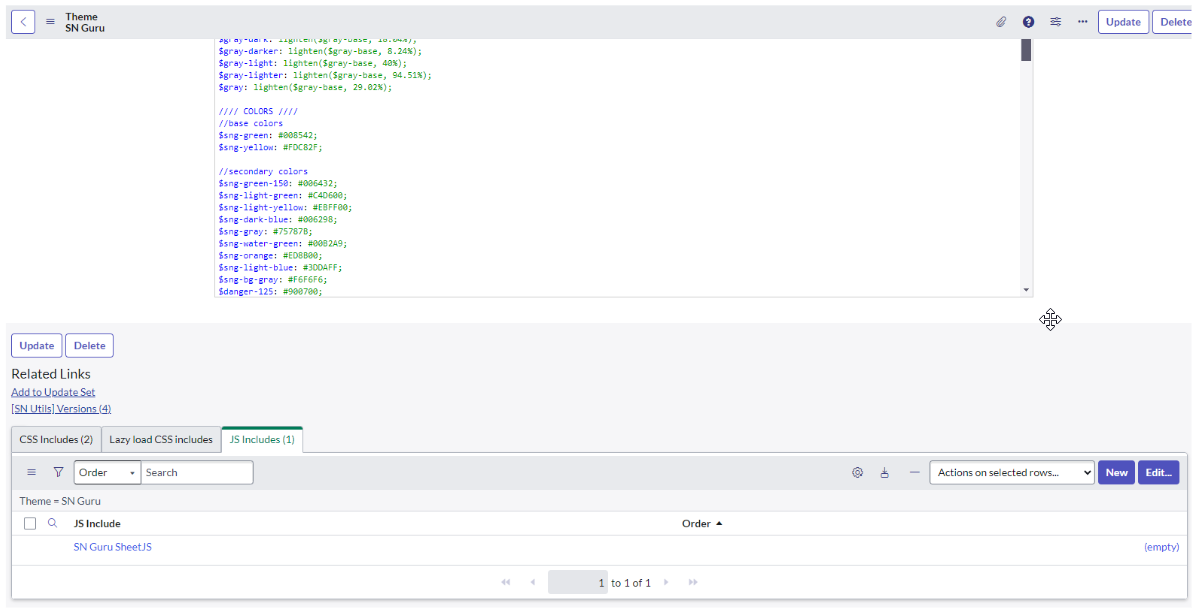
Using the version available on the platform:
Just create a JS Include in the Portal Theme added to the library already available on the platform:
Basic usage example:
For this first example I will create a simple widget with hard-coded data just to show how to use the library. To make things easier I will use a basic example that can be found in the documentation. This example was made using the version of the library that already comes with the platform.
Widget Component: Client Script
Script:
<div class="page-header">
  <h1>ServiceNow Guru - Basic Highchart Example</h1>
</div>

<div id="container" style="width:100%; height:400px;"></div>
Widget Component: HTML Template
Script:
var chartConfirObj = {
  chart: {
    type: 'bar',
  },
  title: {
    text: 'Fruit Consumption',
  },
  xAxis: {
    categories: ['Apples', 'Bananas', 'Oranges'],
  },
  yAxis: {
    title: {
      text: 'Fruit eaten',
    },
  },
  series: [
    {
      name: 'Jane',
      data: [1, 0, 4],
    },
    {
      name: 'John',
      data: [5, 7, 3],
    },
  ],
};

var chart = Highcharts.chart('container', chartConfirObj);
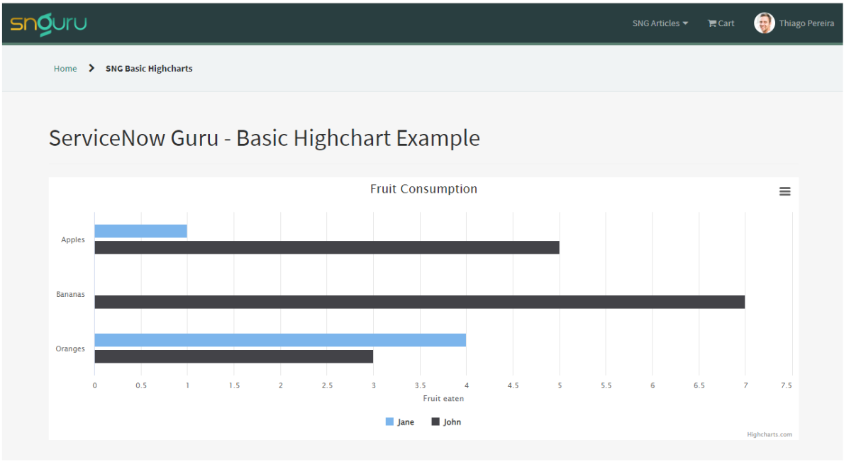
In this example, we see that to build the chart we need to pass an object containing the chart settings we want. The library is huge and I could spend hours here talking about each item in this object and also about each customization possibility, but the library documentation is incredibly complete and can answer all questions:
Now let’s give our graph a bit more reality and bring real data to it.
Widget Component: Server Script
Script:
//variables that will be used to customize the graph
data.font_family = options.font_family || 'SourceSansPro,Helvetica,Arial,sans-serif';
data.fill_color = options.fill_color || '#fff';
data.title = options.title || 'Chart Title';
data.title_color = options.title_color || '#fff';
data.title_size = options.title_size || '14px';
data.title_weight = options.title_weight || 'normal';
data.label_color = options.label_color || '#fff';
data.label_size = options.label_size || '12px';
data.label_weight = options.label_weight || 'normal';
data.label_connector_color = options.label_connector_color || '#fff';
data.slice_label_size = options.slice_label_size || '14px';
data.slice_label_outline = options.slice_label_outline || 'transparent';
data.slice_label_opacity = options.slice_label_opacity || 1;
data.slice_label_weight = options.bar_label_weight || 'bold';
data.table = options.table || 'change_request';
data.agg_field = options.agg_field || 'risk';
data.graphData = [];
//get total requests
var reqCount = new global.GlideQuery(data.table).count();
// get the total requests by risk
var agg = new GlideAggregate(data.table);
agg.addAggregate('COUNT', data.agg_field);
agg.orderBy(data.agg_field);
agg.query();
while (agg.next()) {
var count = parseInt(agg.getAggregate('COUNT', data.agg_field));
var percentTemp = 100 * count / reqCount;
var percent = Math.round(percentTemp * 100) / 100;
var objReq = {
name: agg.getDisplayValue(data.agg_field),
y: count,
percent: percent.toFixed(2)
};
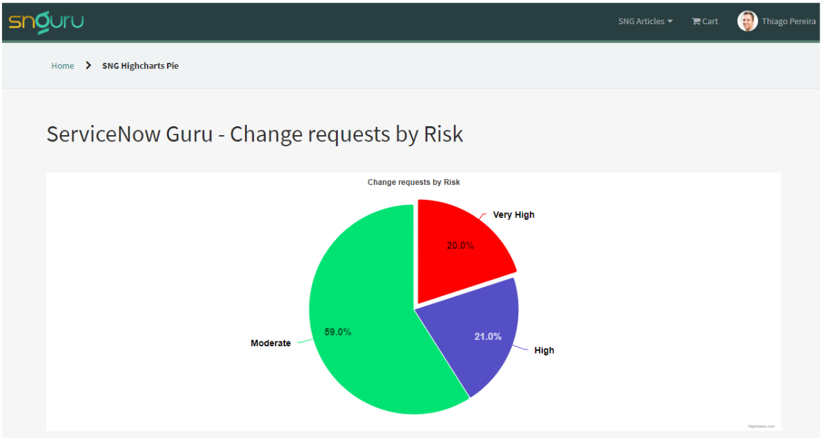
// if the risk is Very High the pie should be sliced and red
if (agg.getValue(data.agg_field) == 1) {
objReq.sliced = true;
objReq.selected = true;
objReq.color = 'red';
}
data.graphData.push(objReq);
}
Widget Component: Client Script
Script:
var chartConfirObj = {
  chart: {
    type: "pie",
    backgroundColor: c.data.fill_color,
  },
  title: {
    text: c.data.title,
    style: {
      fontFamily: c.data.font_family,
      color: c.data.title_color,
      fontSize: c.data.title_size,
      fontWeight: c.data.title_weight,
    },
  },
  tooltip: {
    formatter: function () {
      return (
        "<b>" +
        this.point.name +
        " </b>: " +
        this.y +
        " </b> (" +
        this.point.percent +
        "%)"
      );
    },
  },
  plotOptions: {
    series: {
      allowPointSelect: true,
      cursor: "pointer",
      dataLabels: [
        {
          enabled: true,
          distance: 20,
          connectorColor: c.data.label_connector_color,
          formatter: function () {
            return this.point.name + " </br>" + this.point.percent + "%";
          },
          style: {
            fontFamily: c.data.font_family,
            color: c.data.label_color,
            fontSize: c.data.label_size,
            fontWeight: c.data.label_weight,
            textOutline: c.data.bar_label_outline,
          },
        },
        {
          enabled: true,
          distance: -30,
          format: "{y}",
          style: {
            textOutline: c.data.slice_label_outline,
            fontSize: c.data.slice_label_size,
            opacity: c.data.slice_label_opacity,
            fontWeight: c.data.slice_label_weight,
            textAling: "center",
          },
        },
      ],
    },
  },
  series: [
    {
      name: "Percentage",
      colorByPoint: true,
      data: c.data.graphData,
      dataLabels: {
        style: {
          color: c.data.bar_label_color,
          fontSize: c.data.bar_label_size,
          textOutline: c.data.bar_label_outline,
          fontWeight: c.data.bar_label_weight,
        },
      },
    },
  ],
};

var chart = Highcharts.chart("containerPie", chartConfirObj);
Widget Component: HTML Template
Script:
<div id="containerPie"></div>
Widget Component: Option Schema
JSON:
[
    {
        "name": "table",
        "section": "other",
        "default_value": "change_request",
        "label": "Table",
        "type": "string"
    },
    {
        "name": "agg_field",
        "section": "other",
        "default_value": "risk",
        "label": "Field used to aggregate",
        "type": "string"
    },
    {
        "name": "font_family",
        "section": "other",
        "default_value": "SourceSansPro,Helvetica,Arial,sans-serif",
        "label": "Font family",
        "type": "string"
    },
    {
        "name": "fill_color",
        "section": "other",
        "default_value": "#fff",
        "label": "Fill color",
        "type": "string"
    },
    {
        "name": "title",
        "section": "other",
        "default_value": "Chart title",
        "label": "Title",
        "type": "string"
    },
    {
        "name": "title_color",
        "section": "other",
        "default_value": "#fff",
        "label": "Title color",
        "type": "string"
    },
    {
        "name": "title_size",
        "section": "other",
        "default_value": "14px",
        "label": "Title Size",
        "type": "string"
    },
    {
        "name": "title_weight",
        "section": "other",
        "default_value": "normal",
        "label": "Title weight",
        "type": "string"
    },
    {
        "name": "label_color",
        "section": "other",
        "default_value": "#fff",
        "label": "Label Color",
        "type": "string"
    },
    {
        "name": "label_size",
        "section": "other",
        "default_value": "11px",
        "label": "Label size",
        "type": "string"
    },
    {
        "name": "label_weight",
        "section": "other",
        "default_value": "normal",
        "label": "Label weight",
        "type": "string"
    },
    {
        "name": "label_connector_color",
        "section": "other",
        "default_value": "#fff",
        "label": "Label connector color",
        "type": "string"
    }
]
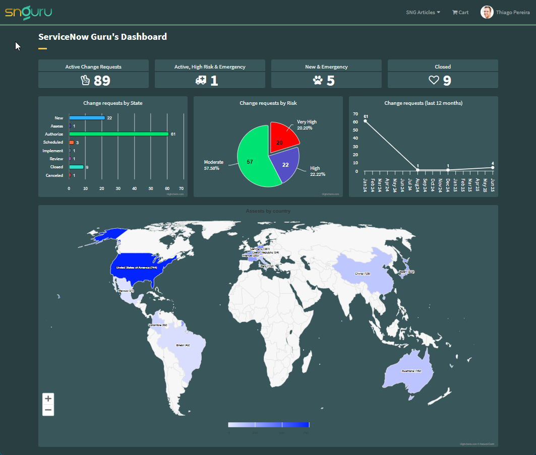
Now, with everything we have shown in this article, we have the possibility of building complex dashboards like the one we saw at the beginning of this article.
Conclusion
Integrating Highcharts with ServiceNow allows you to take your data visualization to the next level, enabling more interactive, detailed, and dynamic reporting. With its wide range of customization options and ability to handle real-time data, Highcharts is an ideal tool for organizations looking to enhance their ServiceNow dashboards and reports. Whether you’re visualizing incident trends, service performance, or asset utilization, this integration can provide critical insights to drive better decision-making.
By following the steps in this article, you’ll be well on your way to creating powerful, interactive charts in ServiceNow, enabling users to explore and understand complex data sets with ease.
Date Posted:
October 8, 2024
Share This:
3 Comments
Comments are closed.


Fresh Content
Direct to Your Inbox
Just add your email and hit subscribe to stay informed.

Very informative, Thiago! Thank you!
Very useful for those who want greater possibilities and more ways to visualize data, congratulations on the content Thiago.
Hi Thiago
I have used Highcharts in ServiceNow for some years now – Highchart is a fantastic product with many options for visualizations.
You are welcome to look at my website for inspiration: https://www.ewatcher.dk
Regards